Good Design Awards Tell a friend
Designers: Tom Briggs, Elena Aker, Tyler Marchesano, Kayla Clarot, Specialized Color and Concept Team, Specialized Bicycle Componenets, Morgan Hill, California, USA
Manufacturer: Specialized Bicycle Components, Morgan Hill, California, USA
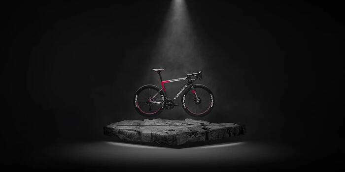
The Forward 50 Tarmac’s paint and design language is a compelling visual narrative that fuses technical precision with emotional storytelling. Drawing from themes of Heat and Time, Reflection, and Rebellious Youth, the design is not merely aesthetic—it’s a layered expression of identity, performance, and cultural resonance.
At first glance, the frame’s finish evokes a sense of motion suspended in time. The use of layered fades—ranging from cool greys to near-black gradients—suggests the passage of time as it might be captured in a long-exposure photograph. These tonal transitions are not abrupt but rather dissolve into one another, mimicking the way heat distorts air or how memories blur at the edges.
This visual metaphor for Heat and Time is further reinforced by the gloss finish, which catches and refracts light differently depending on the angle, creating a dynamic interplay between surface and shadow. The result is a frame that appears to shift and evolve, much like the rider’s journey through effort and endurance.
Reflection, both literal and metaphorical, is embedded in the material choices and finishes. SpectraFlare pearl gloss and metallic obsidian layers are applied over a white base, creating a luminous effect that mirrors the environment.
This reflective quality is not just about visibility or style—it’s about introspection. The bike becomes a canvas for the rider’s personal narrative, reflecting their aspirations, struggles, and triumphs. The mirrored surfaces invite the viewer to see themselves in the machine, blurring the line between object and identity.
The theme of Rebellious Youth is perhaps the most visceral. It emerges in the deliberate asymmetry of decal placements and the bold contrast between muted base tones and high-gloss logos. The design resists uniformity—decals are offset, layered, and sometimes partially obscured, challenging traditional expectations of symmetry and polish.
This aesthetic rebellion is a nod to the younger generation of riders who value authenticity over perfection, who see the bike not just as a tool but as a statement. The use of industrial greys and blacks, punctuated by flashes of metallic white and silver, channels a streetwise energy—gritty, fast, and unapologetically bold.
Together, these elements form a cohesive visual language that speaks to a rider who is both introspective and expressive, disciplined yet defiant. The Forward 50 Tarmac doesn’t just carry a rider forward in space—it carries them forward in story, in self-definition, and in style. It’s a design that honours the past, reflects the present, and dares the future to keep up.


